Why Roman Numerals Endure in Watchmaking — And the Curious Case of IIII
Roman numerals on watch dials are more than decoration — they’re heritage. From medieval towers to Swiss ateliers, the choice of numerals, and the curious survival of IIII, reveals a story where symmetry, superstition, and prestige meet.

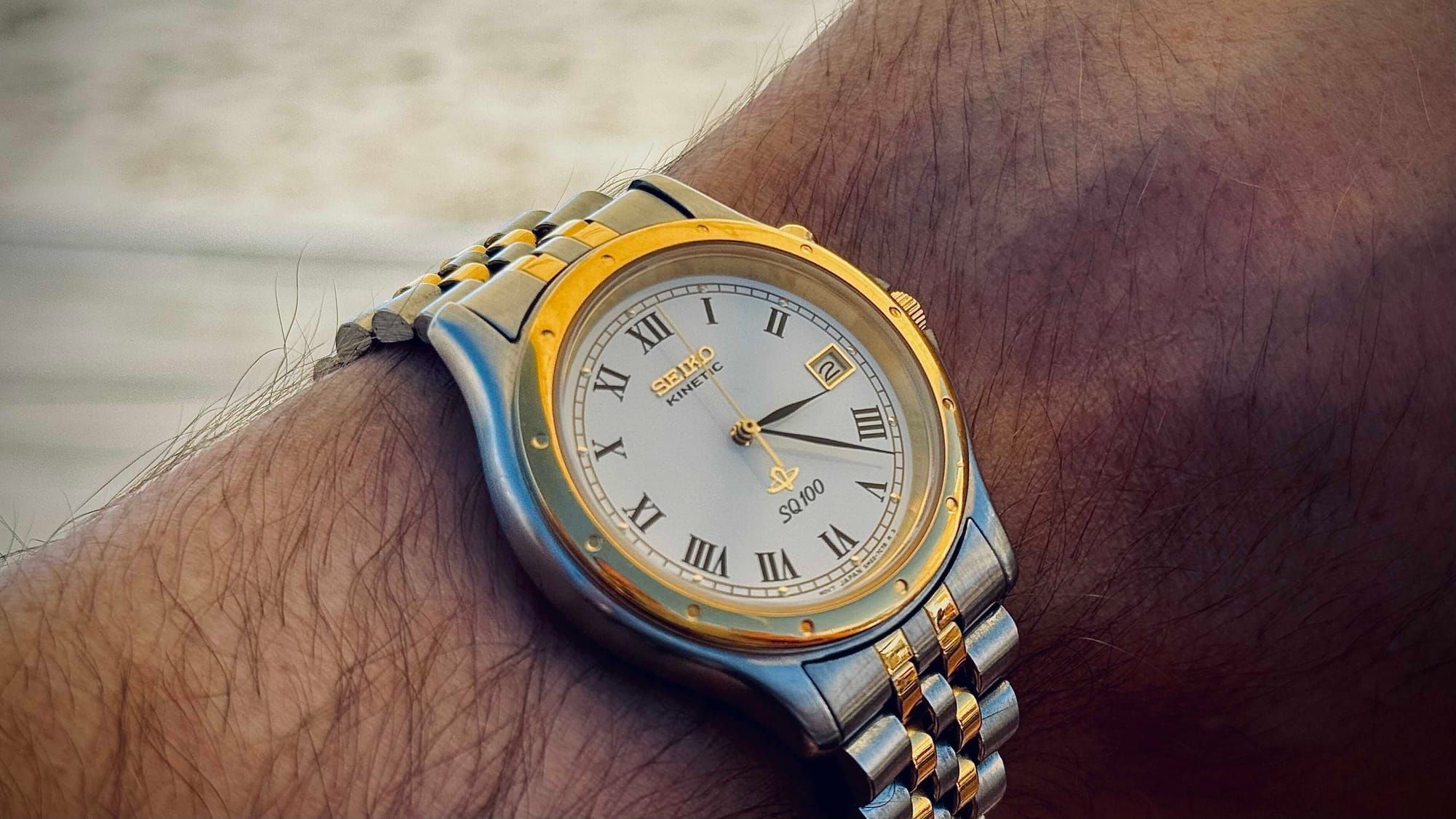
To this day, when collectors lift a Cartier Tank, a Rolex Datejust with a Roman dial, or a Patek Philippe Calatrava, they are greeted not with Arabic digits but with an alphabet born on the stones of the Roman Forum. The watch face, a small circle of metal, is framed by the same numerals that once adorned milestones, triumphal arches, and imperial decrees. The connection is more than stylistic. It signals continuity, permanence, and the authority of tradition.
Time Written in Rome’s Alphabet
Roman numerals in horology are not the most practical way of telling time. A single glance at a digital screen is faster; Arabic numerals are easier to read at speed. But practicality was never the point. Numerals on dials are symbols first, markers of heritage before they are tools of mathematics.
Horological historians agree that the persistence of Roman numerals has to do with their capacity to project gravitas. In a culture where watches are as much about status and lineage as about timekeeping, Roman numerals signal that a piece belongs to the great conversation of history. They evoke monuments, law codes, and liturgy — a visual shorthand for longevity.
This conservatism is not accidental. Scholars of numerical notation have long noted that number systems are among the most conservative features of culture, resistant to innovation even when efficiency demands change. Horology is a perfect case study.
Watches and clocks are practical devices, but they are also personal and public symbols. They are meant to inspire trust, and few scripts inspire it more than Rome’s. To wear a watch with Roman numerals is to carry history itself on one’s wrist, to make a small circle echo with empire. (Numerical Notation, by Chrisomalis)
Clocks Before Watches: Legibility and Legacy
The medieval world did not need numerals to tell time. Public bells sufficed: the strike of a hammer on bronze echoed across a town square, dictating work and prayer. When dials began to appear on monumental clocks in the thirteenth and fourteenth centuries, they introduced a visual system that complemented the sound.
The choice of script mattered. Clockmakers wanted numerals that looked solemn, official, and clear even when carved into wood or painted across wide faces. Roman numerals, already familiar from inscriptions, provided exactly that.
From these monumental clocks, the habit spread into homes. Domestic clocks of the Renaissance and early modern period carried over the same numerals. They created what horological scholars call a “visual grammar of time”: a standard arrangement of twelve Roman numerals around a circle. It was a grammar of authority.
In an age when mechanical timekeeping was itself miraculous, the use of Rome’s numbers made the new machines legible and trustworthy.
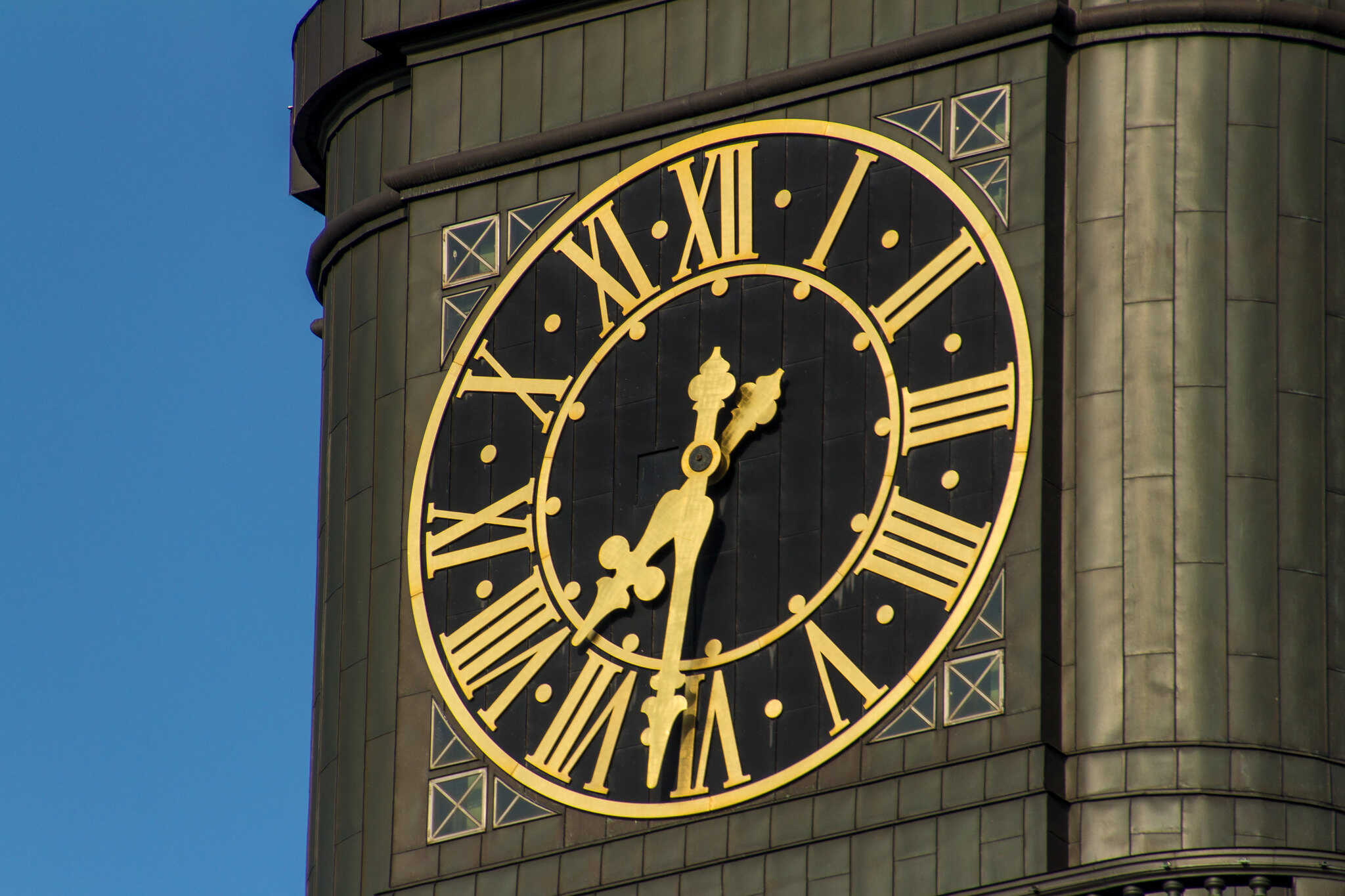
Church Clock of St. Michaelis, Hamburg. Credits: Mark Michaelis, CC BY 2.0
Arabic numerals were already available, but they carried connotations of calculation rather than authority. On dials, Arabic numerals looked modern but less venerable. Roman numerals offered continuity with the civic clocks of the past and with inscriptions every literate person knew. As horology spread from town squares to mantelpieces, the Roman script carried with it a weight of familiarity.
By the seventeenth century, it had become the default for European clockmakers. The convention persisted into watchmaking: the pocket watches of the seventeenth century, the wristwatches of the nineteenth, and the luxury timepieces of today all inherited the same grammar. Roman numerals were not just legible; they were respectable, a sign that the keeper of time acknowledged the authority of history. (The Changing Face of Time, by Desborough)
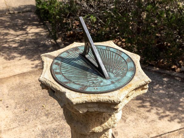
The Problem of Four: IIII vs IV in Watchmaking
If Roman numerals embody tradition, the use of IIII instead of IV embodies tradition at its most peculiar. Nearly every watch and clock uses IIII, the so-called “clockmaker’s four.” The choice has puzzled generations. After all, Roman inscriptions themselves used IV widely. Why should horology diverge?
One explanation is symmetry. With four numerals composed of only I’s (I, II, III, IIII), the dial balances with four numerals composed with V’s (V, VI, VII, VIII) and four with X’s (IX, X, XI, XII). The result is a tripartite harmony: three clusters of four numerals each, equally distributed around the circle.
Replace IIII with IV, and the balance is lost.
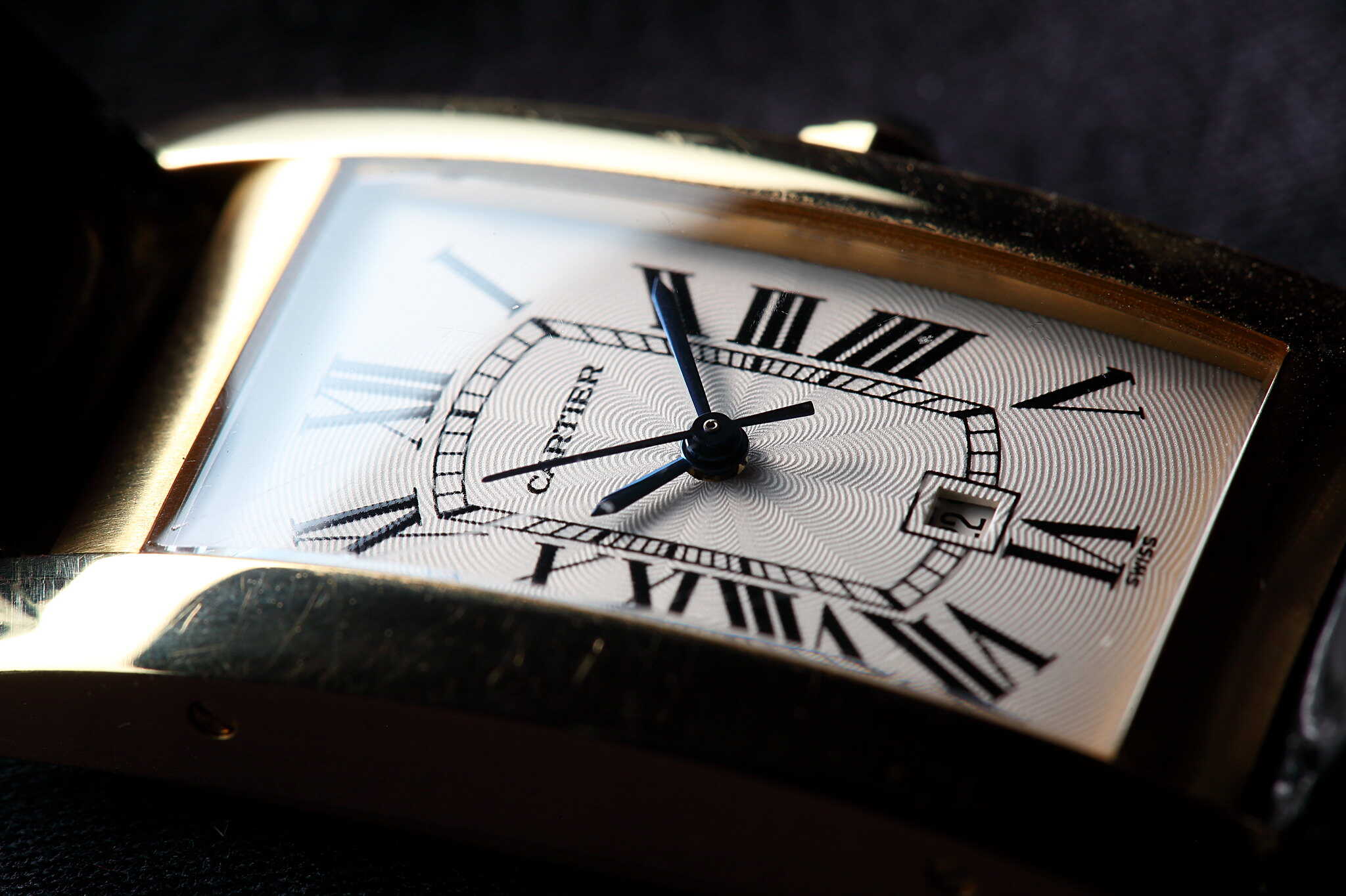
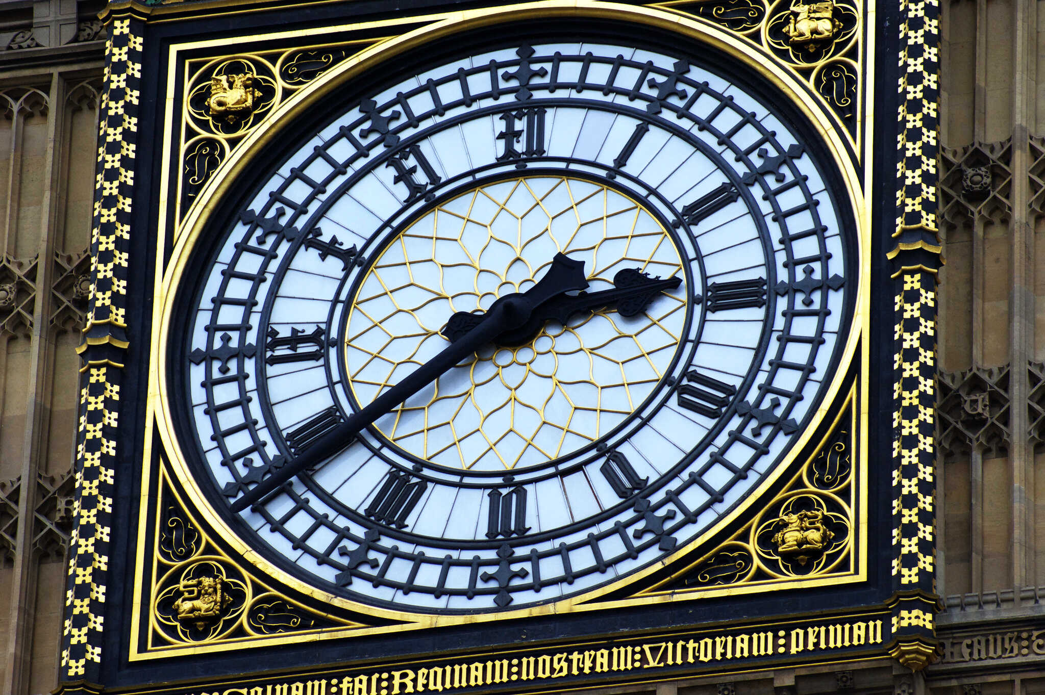
A macro of a Panerai homage. Credits: Guy Sie, CC BY-SA 2.0
The left side of the dial suddenly carries a heavy V that has no counterpart opposite. As one historian of dials observed, the majority of clocks adopted IIII “by far,” precisely to preserve this visual equilibrium. The goal was not arithmetic but harmony.
Other theories have circulated. Some claim that IV was avoided to prevent confusion with the initials of Jupiter (IVPITER). Others point to practicality: four strokes were easier to cast in metal than one stroke and a V. The most colorful legend involves King Charles V of France, who supposedly commanded clockmakers to use IIII on all his dials, and whose preference spread throughout Europe. Whether apocryphal or not, it illustrates a truth: horological conventions often originate in authority and then persist through repetition.
Modern watch museums acknowledge these competing explanations. The Seiko Museum in Tokyo presents the Charles V anecdote as one possible origin, alongside the symmetry theory. Collectors debate the point endlessly, but the reality is simple: once a convention dominates, it resists change. And so, centuries later, a Rolex Datejust or a Cartier Tank still displays IIII. (Numerals on Clock and Watch Dials, by Hering; Clockmaker’s Four, by Durel)
Symmetry and the Aesthetics of Time
The case of IIII underscores a deeper truth about horology: dials are artworks as much as instruments. Time can be displayed in many ways, but to inspire confidence, it must also look ordered. The circle of numerals is therefore not only a measure of hours but a composition of shapes.
Watchmakers have always treated dials as canvases. The numerals, hands, and chapter rings together create a visual harmony that reassures the viewer of accuracy and order. Roman numerals, with their tall, upright strokes, lend an architectural quality, like miniature columns framing the dial. Within this architecture, IIII is the keystone: its visual balance stabilizes the whole.
Symmetry mattered especially in the early centuries of clockmaking, when mechanical precision was limited. A clock might lose or gain minutes, but a dial that looked symmetrical conveyed trust. The viewer forgave the mechanism’s flaws because the face promised order. In watches, this aesthetic authority became even more important. A timepiece worn on the body was a jewel as well as a tool. The dial’s design declared status, and Roman numerals with IIII became hallmarks of sophistication.
Even today, collectors react instinctively to this balance. A dial with IV feels unusual, sometimes even unsettling, because it disrupts the visual symmetry the eye expects. In luxury watchmaking, where heritage and elegance are paramount, such disruption is rarely welcome. This is why IIII persists not by accident but by design. (A General History of Horology, by Turner)
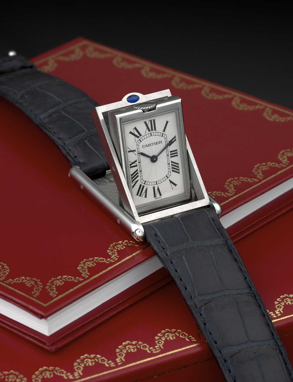
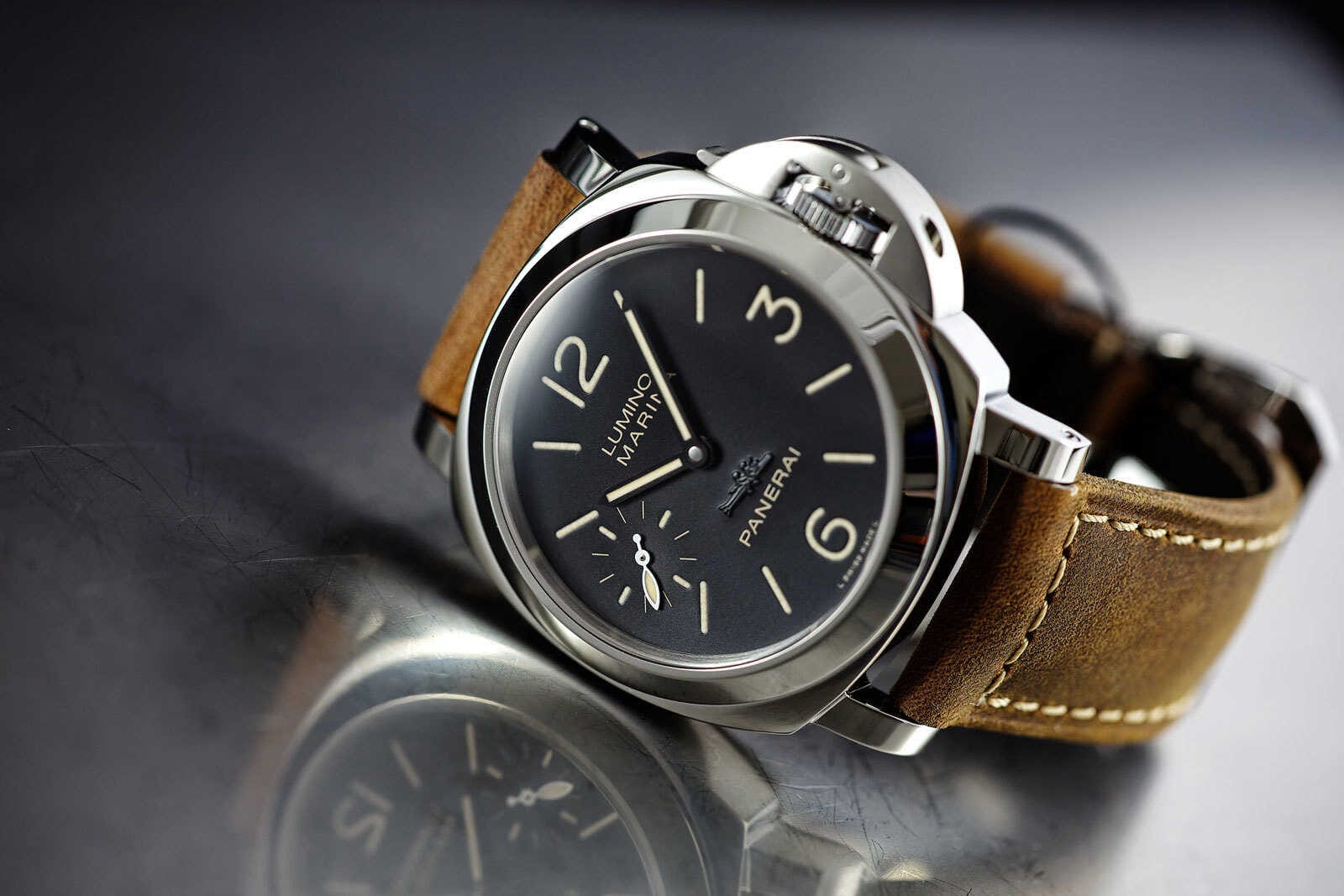
Image #1: Cartier Tank Basculante. Credits: kitchener.lord, CC BY-NC-ND 2.0, Image #2: A Panerai Lumino Marina Watch. Credits: Johnson Watch, Public domain
Tradition That Outlives Function
The irony is that Roman numerals are now less functional than ever. Few people calculate time from them quickly; fewer still need them in an age of digital clocks. And yet they persist. Why? Because horology is about more than function. It is about tradition, identity, and symbolism.
Luxury watches, in particular, sell narratives as much as mechanisms. A Rolex with Roman numerals suggests permanence. A Cartier dial covered in seriffed numerals recalls the Paris of the early twentieth century. A Patek Philippe that chooses Roman markers places itself in a lineage stretching back to Renaissance clocks.
Roman numerals also resist the homogenization of Arabic numerals. Arabic digits dominate our lives in banking, computing, and communication. By contrast, Roman numerals are rare, appearing only in ceremonial contexts—on monuments, in royal inscriptions, in film credits. Their rarity makes them special. On a dial, they elevate a watch from instrument to heirloom.
As one scholar of numerals notes, notations are never neutral. They encode values. In horology, the Roman system encodes prestige. When a watchmaker chooses I–XII instead of 1–12, they are not choosing clarity but continuity. They are inviting the wearer into a tradition older than the watch itself. (Numerical Notation, by Chrisomalis)
Exceptions to the Rule
Tradition does not mean uniformity. There are exceptions. The most famous is London’s Great Clock of Westminster—Big Ben—which uses IV instead of IIII. The choice makes the tower distinctive, a visible counterpoint to the majority of European clocks. But it also proves how unusual the deviation is. Tour guides still point it out precisely because the expected form is IIII.
Other exceptions are scattered. Certain modernist designers in the twentieth century experimented with IV, seeking to break from convention. Some brands today produce models with Arabic numerals or minimalist markers, abandoning numerals altogether. Yet these are departures from tradition, not the tradition itself. The mainstream of luxury watchmaking continues to rely on Roman numerals, with IIII firmly in place.
The persistence of this convention demonstrates the power of repetition. Once a habit enters the repertoire of clockmakers, reinforced across centuries of dials, it becomes almost impossible to uproot. Even in the most innovative watches of today, the pull of tradition remains.
Time, Tradition, and Identity
In the end, Roman numerals endure in watchmaking not because they are useful but because they are meaningful. They connect the present to the past, the wristwatch to the tower clock, the pocket watch to the Roman milestone. They embody symmetry, tradition, and superstition in a single script.
The survival of IIII is the most vivid symbol of this endurance. It is wrong in Roman epigraphy, but right in horology. It balances the dial, satisfies the eye, and anchors centuries of craft. Whether born of symmetry, superstition, or the decree of a king, it has become part of watchmaking’s DNA.
As Hering wrote almost a century ago, “The form of numerals on dials has less to do with mathematical correctness than with tradition and custom.” Time itself has changed, but the numerals that mark it remain. Watches tick forward, but their faces look backward, to Rome.
To glance at a dial is to glimpse a paradox: a modern machine wrapped in an ancient language, a tool of precision adorned with a superstition, a symbol of progress bound by tradition. It is a paradox that horology has embraced. The hands move on; the numerals stay the same. (Numerals on Clock and Watch Dials, by Hering)

About the Roman Empire Times
See all the latest news for the Roman Empire, ancient Roman historical facts, anecdotes from Roman Times and stories from the Empire at romanempiretimes.com. Contact our newsroom to report an update or send your story, photos and videos. Follow RET on Google News, Flipboard and subscribe here to our daily email.
Follow the Roman Empire Times on social media: